
 When thinking of public health issues, one of the items that comes up with increasing frequency is smoking. You don’t have to be a nurse, doctor or other health care professional to know that smoking is bad for your health. However, it is still a widespread practice, due to the addictiveness of smoking, and the pleasure and social status it provides in some cases. No matter your salary, or worldly influence, though, smoking will likely catch up with your health. And, even if you manage to escape the effects, you might affect others’ health with your smoking habit through secondhand smoke. Here are links to 25 infographics about smoking, public heath and the human body:
Smoking Stats
 Learn more about smoking stats, such as when people start, and how many deaths are caused each year by smoking.
- Global Tobacco Trade: Follow world routes for cigarettes, and get interesting facts about smoking, including stats about who is smoking (and where). Also includes an interesting list of the chemicals found in cigarettes and cigarette smoke. Fascinating infographic from Princeton.
- Income Level and Smoking: Interestingly, income level has a correlation to smoking. Trendsspotting offers an interesting infographic illustrating the fact that those in lower income households are more likely to smoke. It’s an interesting look at who smokes — and why income matters.
- Facts About Smoking: Drippet offers an interesting infographic describing different facts about smoking. It includes representations of racial distribution of cigarettes, ages of smokers, and deaths caused by smoking.
- Tobacco Use in the U.S.: If you are interested in smoking rates in the U.S., an infographic from the Global Resource for Advancing Cancer Education (GRACE) offers interesting insight. It shows that smoking has been declining in the U.S., and it shows the rates in lung cancer as well.
- Global Tobacco Control: Smoking bans have been instigated in different countries, and an interesting infographic from New Scientist shows places where smoking is banned around the world. It also shows countries where a treaty to increase regulation of tobacco has been signed.
- Productivity and Smoking: According to an infographic based on a San Diego State University study, differences in pay between female smokers and non-smokers in the Navy can be linked to smoking. Indeed, the study found that smokers were less productive than other workers. While this study focused on the Navy, and only on women, there could be implications for wider productivity.
- Tobacco Spending: Apparently, tobacco companies spend more on advertising than states spend on prevention programs. The deep pockets of Big Tobacco continue to provide adequate funding for the next generation of smokers.
Health Effects
 Learn more about the health effects of smoking with the following infographics, which include information on deaths related to smoking.
- Smoking Contributes to Death: Smoking has been shown to contribute to death. Indeed, an infographic found at the Health Watch Center shows that smoking contributes to six of the top eight killers worldwide.
- U.S. Deaths and Smoking: The Centers for Disease Control and Prevention have a handy infographic describing the different causes of death that are attributable to smoking each year. This includes heart disease, stroke, and, of course, lung cancer.
- Preventable Cause of Death: According to the government web site, Health People, the leading cause of preventable disease and death is smoking. Smoking is so bad for you that not doing it is the number one way to reduce your chances of getting a life-threatening disease.
- Smoking and Sleep: Smoking actually affects how you sleep. Sleep is important to your health, so if you are smoking — and it is affecting your sleep — that could be another health problem you can chalk up to the ills of smoking.
- Risk Factors and Lung Cancer: An infographic from GRACE offers insight into risk factors that contribute to lung cancer. The graphic compares risk factors like race, vitamin intake and chronic respiratory infection to smoking. And smoking for 30 years can increase your chance of lung cancer way more than the other factors — by up to 20 times or more!
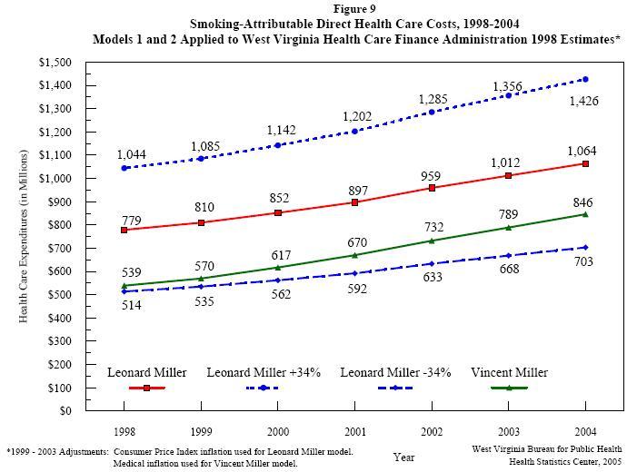
- Health Costs and Smoking: The State of West Virginia has an interesting infographic describing health care costs attributable to smoking. If this holds elsewhere, it is clear that the effects of smoking include higher health care costs for all.
Secondhand Smoke
 Even just breathing in when someone around you is smoking can unhealthy. Here are some infographics related to secondhand smoke.
- Toxic Secondhand Smoke: The CDC offers this interesting poster and infographic that illustrates the toxicity of secondhand smoke, and how it kills.
- Secondhand Smoke and Children: Another poster from the CDC offers information on the effects of secondhand smoke on children. These effects include SIDS, ear infection, lung problems and severe asthma.
- Secondhand Smoke Exposure: Due to the nature of secondhand smoke, it is not really surprising that that the number of people in the U.S. exposed to it far exceeds the number of smokers. Indeed, an infographic from the CDC indicates that each smoker exposes more that two non-smokers to the hazards of smoke.
- Risk for Passive Smokers: Those who inhale secondhand smoke on a regular basis will see a 25% increase in the likelihood of developing lung cancer, according to an infographic provided by the Beverly Fund.
- Cost of Secondhand Smoke: BlueCross BlueShield offers an interesting infographic that illustrates the cost of secondhand smoke in death and in dollars.
- Conditions Caused by Secondhand Smoke: The State of Minnesota offers an interesting look at the costs of certain conditions caused by secondhand smoke, including those related to low birth weight, heart attack, ear infection and lung cancer.
Quit Smoking
 Are you interested in quitting? Here are some intersting infographics about quitting smoking.
- When You Quit: This cool infographic found on BlissTree shows a timeline of the changes in your body that result from the moment you stop smoking. An interesting look at how you can reap almost immediate benefits when you quit.
- Support for Quitting: One of the most difficult things about quitting smoking is finding help and support. And it’s not hard to see why. According to the CDC, most smokers receive advice to quit — without getting information on helping them quit.
- Higher Prices and Smoking: GOOD offers an interesting infographic that allows you to compare the cost of smoking with how many people in the state smoke. Also includes states with certain smoking bans. Look at what factors might contribute to quitting.
- Smoking Cost Calculator: This basic infographic is interactive, allowing you to enter how much you smoke each day, and uses costs of cigarettes and inflation to figure out how much money you could save if you quit smoking.
- Attempts to Quit: Where are people trying to quit smoking? This infographic from StateMaster.com lists states, and the percentage of smokers trying to quit.
- How Cigarettes Taste: BoingBoing offers an interesting (and subjectively tongue in cheek) look at how cigarettes might taste according to mood. It includes such items have how good they taste when you are stressed, trying to quit, or starting again.